Art for Art's sake?
There's a scene in the 1966 movie Blowup 1 where an abstract painter who just splatters paint indiscriminately over canvases states 'they don't mean anything when I do them – just a mess'. And recently I found a statement on an American art gallery web site: 2 'Abstract art focuses on the use of colour and shapes to convey messages, meaning, and emotions, allowing viewers to create their own interpretations of every piece.' I do wonder what those messages, meanings and emotions amount to if every viewer has to create their own interpretations.
So both these statements lead me to ask what such art is really for. Unless it's merely a product of personal self-indulgence, art is supposed to be a vehicle of communication, and that implies that there's something specific to communicate. But if the message contains no recognisable information, leaving the meaning to be invented entirely by the recipient, what's the function of the message, or indeed its source, at all?
This is not a red herring in the context of poetry. Many modern fashions in form and presentation seem to contribute nothing to the message, serving no purpose other than to impose a barrier between the work and the reader. Just for example, here's a fragment from the otherwise rather nice poem Lacrimarium 3 by Hailey Leithauser:
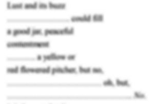
I've intentionally blurred the text, as for now I'm only interested in the form, which poses the question: what, if any, contribution does the scattering of fragments of text make to the poem from the reader's point of view? Any contribution it makes could only really be appreciated by a silent reader, as when the poem is recited the fragmentation must (if at all) only be crudely conveyed (for example by pauses). So the exact length of the white space in lines 2, 5, 7 and 8 would seem relatively unimportant unless this is a piece of graphic art as well as a poem. And if it's graphic art, what's the meaning imparted by the layout? But solely as regards the text, we've been conditioned for several thousand years to expect text to flow continuously (and the physiology of vision tends to favour that), so these scattered words and phrases do make reading more difficult, potentially putting an unnecessary barrier between the reader and the meaning of the words. Ms. Leithauser has at least done us the courtesy of padding the spaces with lines of dots, which alleviate some of the eye strain of seeking the start of functional lines. But in most instances of similar form this is not done, and I've even encountered some cases where words themselves have been fragmented, leaving individual letters scattered across the page. So my fundamental questions are 'why?' What's the intended effect? And has any author ever investigated whether it's actually worked for the reader? I have to say I quite like the idea behind the text of Lacrimarium but I'd have grasped the meaning of that idea more swiftly if the form had been less apparently arbitrary. Quite a bit of mental effort was expended trying (and ultimately failing) to work out what the form was supposed to impart. So, a word of caution. All of us are subject to the danger of getting absorbed in the process of creation – unwittingly writing for ourselves as authors rather than for our readers. But the snag is that we know the significance of every aspect of our poem, but the reader won't – they must try to work it out. Consequently, what works for us may not work for them. So if we're in the business of getting published, we should avoid letting subservience to our personal artistry dominate our thinking – it's fundamentally the needs of the reader that matter most if we don't want our messages to fall flat. [1] MGM 1966, directed by Michelangelo Antonioni [2] Clarendon Fine Art [3] Lacrimarium at Literary Matters